Web Label Editor
The ThermalLabel Web Editor Add-on is a first-class barcode label designer component for ASP.NET websites (Legacy MVC & WebForms and ASP.NET CORE). It gives your web apps an end-user visual label editor. The component leverages and requires the ThermalLabel SDK and is built on jQuery and HTML5 Canvas (Fabric.js 1.x). It runs on Windows, Linux, Mac & Android clients with modern browsers.
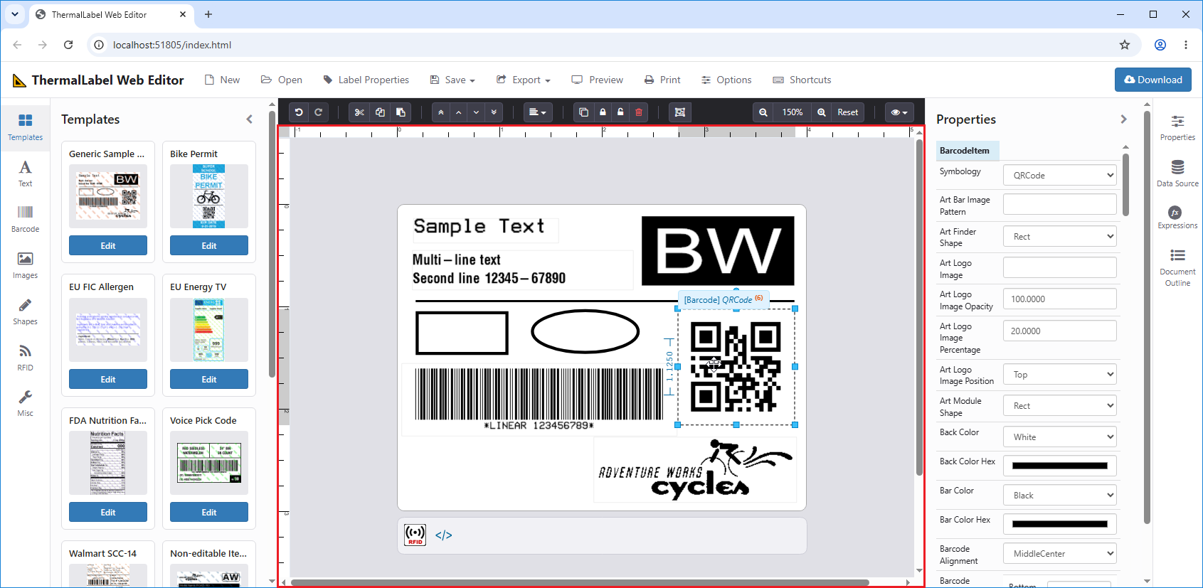
The editor (highlighted inside the red rectangle) provides visual aids for creating text, barcodes, pictures, tables, RFID tags and shapes; Z-ordering; zooming; in-place text editing; grouping and multi-selection; duplex (two-sided) design; undo/redo; clipboard support; and much more. It is also highly customizable, so you can skin it to match the UI of the app that hosts it.
With the Web Editor, your end users can create, load, edit and save ThermalLabel objects as XML or JSON template definitions.
Note
This document is a feature guide. Every property, method and event is described in detail in the API reference (apiref.md). Here the features are grouped by topic, with short examples.
System Requirements
Server-side
- Windows Server, or Linux if using ASP.NET CORE
- Legacy ASP.NET 4.6.1+ or ASP.NET CORE 2.0+
- ThermalLabel Web Editor Server Component 16.0 (
Neodynamic.Web.ThermalLabelEditor.dll) - ThermalLabel SDK 16.0 (
Neodynamic.SDK.ThermalLabel.dll) - ThermalLabel SDK 16.0 Web Printing (
Neodynamic.SDK.ThermalLabel.WebPrinting.dll) - SkiaSharp 1.68.3+
- System.Text.Encoding.CodePages 4.4.0+
Client-side (web page)
- ThermalLabel Web Editor JavaScript Component 16.0 (
ThermalLabelWebEditor-16.0.xx.xxxx.js). It already bundles thefabric.CanvasExextension (fabric.canvasex.js, MIT), so you do not need to reference it separately. - ThermalLabel Web Editor CSS 16.0 (
ThermalLabelWebEditor-16.0.css) - jQuery 1.7+
- Fabric.js 1.5+ (1.x line only; Fabric 2.x/3.x/4.x/5.x are not supported)
Client OS & browser
- OS: Windows, Linux, Mac & Android. Printing is only available on Windows clients and requires .NET Framework 4.6.1+.
- Browser: Edge, Chrome, Firefox and Safari (latest versions); Internet Explorer 10+ is supported for the basic features.
- TLClientPrint 16.0 (printing from Windows clients only)
Sample Application Projects
The ThermalLabel SDK repo at GitHub provides ASP.NET WebForms, MVC & ASP.NET CORE sample projects that use the ThermalLabelWebEditor component. Open them with Visual Studio to learn how the component works and how to interact with it.
Important
These sample projects are very simple and do NOT demo all the ThermalLabel SDK and Editor features. They may contain errors, bugs or bad practices, so do not treat them as a model for how to structure your own app. They only demonstrate how to interact with the ThermalLabelWebEditor component.
Architecture Overview
The editor is split in two parts that work together:
- Client (browser): a TypeScript/JavaScript component on top of Fabric.js 1.x. It manages the design surface, selection, handlers, zoom, undo/redo, clipboard and so on. It holds a client-side object model (
ThermalLabeland item classes such asTextItem,BarcodeItem,ImageItem, etc.) under theNeodynamic.SDK.Printingnamespace. - Server (your ASP.NET app): an HTTP Handler (WebForms) or Controller (MVC / ASP.NET CORE) that you code, using the server-side
Neodynamic.Web.ThermalLabelEditorcomponent.
Every time a TextItem, BarcodeItem, ImageItem or TableShapeItem changes or is resized/zoomed, the editor sends an asynchronous request to your handler/controller and displays the returned image. Shapes (rectangle, ellipse, line), repeaters, RFID tags and literals are drawn locally and do not need a round trip for rendering.
All requests are POST calls to the URL given by thermalLabelWebEditorControllerName and carry an Action field:
| Action | Purpose |
|---|---|
Render |
Renders a Text, Barcode, Image or Table item to PNG |
Validate |
Validates whether a barcode can be printed as a resident (native printer) element |
GetLabelTemplate |
Converts the label model to an XML or JSON template |
GetLabelPreview / GetLabelThumbnail |
Preview and thumbnail generation |
GetLabelAsPdf / GetLabelAsImage |
PDF and image export |
GetPrinterCommands |
Printer commands (ZPL, EPL, etc.) generation |
Save |
Downloads the template as a file |
Print |
Registers a print job for TLClientPrint |
Expressions |
Returns the list of supported expressions |
GetI18NResourceKey |
Returns localized UI strings used by the editor |
Tip
If the server fails to render an item, the editor shows a "missing image" placeholder on the design surface and raises the onError event with the server message.
Quick Start
1. Reference the resources and add a host element
<link rel="stylesheet" href="ThermalLabelWebEditor-16.0.css" />
<script src="jquery.min.js"></script>
<script src="fabric.min.js"></script>
<script src="ThermalLabelWebEditor-16.0.xx.xxxx.js"></script>

<div id="editorHost" style="width:100%; height:600px"></div>
2. Create, enable and load the editor
var Printing = Neodynamic.SDK.Printing;
var TLE = Neodynamic.Web.Editor.ThermalLabelEditor;

// Required: URL of your MVC Controller action / HTTP Handler
TLE.thermalLabelWebEditorControllerName = "ThermalLabelWebEditorHandler/ProcessRequest";
// Optional: only if the editor is hosted at a different root than the page
// TLE.websiteRootAbsoluteUrl = "https://myserver.com/myapp";

// The container is a jQuery SELECTOR string
var editor = new TLE("#editorHost");
editor.enableEditor();               // builds the editor infrastructure

var label = new Printing.ThermalLabel();
label.unit_type = Printing.UnitType.Inch;   // set the unit BEFORE sizes
label.width = 4;
label.height = 3;

editor.loadThermalLabel(label);
3. Add items by code
var txt = new Printing.TextItem();
txt.text = "Hello World";
txt.x = 0.25;
txt.y = 0.25;
txt.width = 2;
txt.height = 0.5;
editor.addItem(txt);
4. …or let the user draw them with the mouse
editor.active_tool_item = new Printing.BarcodeItem();
editor.active_tool = Neodynamic.Web.Editor.EditorTool.Barcode;
// The user now drags on the surface. When done, the tool returns to Pointer
// and the newItemCreated event is raised.
Available tools: Pointer, Rectangle, Ellipse, Line, Text, Barcode, Image, Literal, RFIDTag, Table and Repeater.
Working with Labels and Items
Loading templates
You can load a label from a template or build it from scratch:
var tl1 = Printing.ThermalLabel.createFromXmlTemplate(xmlString);
var tl2 = Printing.ThermalLabel.createFromJsonTemplate(jsonStringOrObject);
editor.loadThermalLabel(tl1);
loadThermalLabel(tl, options) accepts:
resetUndoHistory(defaulttrue): clears the undo/redo history.resetActivePage(defaulttrue): returns to page 0 and resets the view rotation.
Use resetUndoHistory: false, resetActivePage: false if you only want to refresh the editor from the same label (this is what the editor itself does internally when label properties such as size or unit change).
Item types
| Class | Rendering | Notes |
|---|---|---|
TextItem |
Server | Native printer fonts, TrueType and custom fonts; in-place editing |
BarcodeItem |
Server | 180+ symbologies (BarcodeSymbology enum), including 2D and postal codes |
ImageItem |
Server | Monochrome conversion settings, flip, lock aspect ratio |
TableShapeItem |
Server | Rows and columns with individual fill colors |
RectangleShapeItem |
Client | Individual corner radius, stroke styles (solid, dash, dot) |
EllipseShapeItem |
Client | Stroke styles |
LineShapeItem |
Client | Horizontal, vertical and diagonal lines; stroke styles |
RepeaterItem |
Client | Design-time placeholder with repeat count |
RFIDTagItem |
Client | Displayed in the tray |
LiteralItem |
Client | Raw printer commands; displayed in the tray |
Units
Every label and item has a unit_type (Inch, Mm, Cm, DotsPerInch, Point, Pica, Mils, Twip). Internally the editor works at 96 DPI pixels, and all property getters/setters convert from/to the item unit. When you change label.unit_type, all items are converted automatically and the rulers and grid are updated. num_of_fractional_digits (default 4) controls the precision of the width/height values shown on the selection handlers.
Programmatic changes
Changing a property on an item object does not repaint it by itself. After you change properties, refresh it and (if you want it in the undo history) save the state:
var item = editor.current_selection;
item.text = "New text";
editor.updateSelectionItemsProperties();   // refreshes (re-renders) the selected item
editor.saveCurrentLabelCanvasState();      // registers an undo step
Selection, Multi-Selection and Grouping
Single selection
Click an item to select it. The editor displays handles for move, resize and rotate, plus the item's width and height. editor.current_selection returns the selected item (or null).
Marquee (rubber-band) multi-selection
Click on an empty area of the design surface and drag to draw a selection rectangle (marquee). When the mouse is released:
- Items fully contained in the rectangle are selected.
- Items that belong to a group are selected only if all the group's members are inside the rectangle.
- Only items on the active page are considered (see Duplex). Tray items are never marquee-selected.
- If more than one item is selected, the editor creates a temporary group so they move, resize, rotate, lock, delete and z-order together. A single hit simply selects that item.
- Clicking on an empty area (or on an item outside the temporary group) dissolves the temporary group.
To keep the temporary group as a permanent one, call createGroup().
Note
Marquee selection is enabled for mouse and pen input only. On touch devices use the click-to-group workflow below.
Click-to-group workflow
editor.startGroup();     // each item the user clicks is added to the group
// ...user clicks items...
editor.createGroup();    // commits the group (assigns a common group_name)
editor.cancelGroup();    // cancels instead
editor.unGroup();        // dissolves the group of the current selection
group_started and items_in_started_group help you enable/disable your UI buttons. getItemsInGroup(groupName) returns the items of a group.
Group members behave as a single unit: moving, resizing, rotating, locking, deleting, copying and z-ordering the selected item applies to all members that are editable, visible and (for transforms) not locked.
Programmatic selection
All of these return the number of items selected and switch to the right page automatically on duplex labels:
editor.selectAll();
editor.selectItemByIndex(0);
editor.selectItemByName("txtTitle");
editor.selectItemsByNames(["txtTitle", "bcSku"]);
editor.selectItemsByTag("price");
editor.selectItemsByType("BarcodeItem");
editor.selectItemsByIndexes([0, 2, 5]);
When more than one item is selected programmatically, a temporary group is created, exactly like a marquee selection.
Layout Tools
var LayoutAlignment = Neodynamic.Web.Editor.LayoutAlignment;

editor.alignItems(LayoutAlignment.Left);               // align to the selected item (pivot)
editor.alignItems(LayoutAlignment.CenterHorizontal);
editor.alignItems(LayoutAlignment.DistributeVertical); // needs 3+ items

editor.setSelectedItemsToSameSize(true, false);        // same width
editor.moveSelectedItems(0.1, 0);                      // nudge, in label units

editor.bringToFront();
editor.sendBackward();
editor.lockSelectedItems();
editor.unlockSelectedItems();
editor.deleteSelectedItems();
editor.deleteAll();
Alignment options: Left, Right, Top, Bottom, CenterHorizontal, CenterVertical, DistributeHorizontal, DistributeVertical.
- By default the items to align are the current selection (or its group). You can also pass your own list of items and a pivot item.
- Z-order methods (
bringForward,bringToFront,sendBackward,sendToBack) also reorderlabel.items, which is the order used when printing. deleteAll()clears the whole label, or only the active page on duplex labels.
Zooming, Rulers, Grid and Snapping
Zoom
editor.zoom = 150;     // percent; valid range 10 - 1000
var current = editor.zoom;
All items are rescaled and server-rendered items are re-rendered at the new resolution so they stay sharp. The editor remains centered when the host container is resized; call centerEditor() manually if your layout changes in ways that are not observable.
Rulers
Horizontal and vertical rulers are displayed using the label's unit (inches, mm, points, etc.), scale with the zoom level and highlight the extent of the current selection. Toggle them with editor.show_ruler = true/false.
Grid and Snap to Grid
editor.grid_size = 0.25;                                   // in label units
editor.grid_type = Neodynamic.Web.Editor.GridType.Dots;    // Lines | Dots
editor.show_grid = true;
editor.snap_to_grid = true;                                // position & size snap to the grid
Snap to grid applies when drawing a new item and after moving or resizing an existing one.
Snap to Items (smart guides)
editor.snap_to_items = true;
While dragging an item, dashed guide lines appear when its edges or center align with another item's edges or center, and the item snaps to them on release. Items on the other page of a duplex label are ignored. The guide color is themable (--guidelines-color).
Angle snap
editor.angle_snap (default 5) rounds the rotation to multiples of that many degrees. Use 0 to disable it. Native printer fonts, barcodes, tables and repeaters are always restricted to 90° steps because the printer cannot rotate them otherwise.
View Rotation
The design surface can be rotated in 90° steps without changing the label you will save or print. This is useful to design labels that are fed landscape but easier to read as portrait.
var Rotate = Neodynamic.Web.Editor.Rotate;   // None, Degree90, Degree180, Degree270
editor.rotateView(Rotate.Degree90);
var current = editor.view_rotation;
- The label dimensions are swapped, and every item is repositioned and rotated accordingly (lines change orientation).
- Everything that leaves the editor (save, templates, preview, print, PDF, image, clipboard) is normalized back to the original orientation automatically.
- The undo history stores the view rotation too, so undo/redo restores it.
- Override
viewRotationChanged()to update your UI. - Duplex labels rotate page by page and keep the relative gaps.
Duplex (Two-Sided) Design
Duplex labels have a front and a back side. The editor shows one side at a time and offers an animated page flip.
label.is_duplex_design = true;     // front/back pages are created automatically
editor.loadThermalLabel(label);

editor.flipPage();                 // animated 3D flip to the other side
editor.active_page_index = 1;      // jump to a side without animation (0 = front, 1 = back)
What you get:
- A Front/Back legend above the label and a flip button at its right (both localized and themable).
- A 3D "card flip" animation (
rotateY) when flipping. - Items on the inactive side are hidden and cannot be selected or marquee-selected.
- Selecting an item by code (
selectItemByName, etc.) jumps to the side where the item lives. - Pasting on the other side maps the items into that side. See Clipboard.
- Changing the label size keeps both pages in sync.
- When exporting, the label width is normalized to the combined width of both pages (as the SDK expects).
deleteAll()only clears the active side.
When the user (or your code) turns is_duplex_design off, items that live outside page 0 would be lost. Override beforeDuplexDesignDisabled(itemsToRemove) to confirm; return false to cancel the change:
editor.beforeDuplexDesignDisabled = function (itemsToRemove) {
    return confirm(itemsToRemove.length + " item(s) on the back side will be removed. Continue?");
};
Label Shape, Margins and Background
- Shape:
label.shape = Printing.LabelShape.Ellipserenders the label frame as an ellipse (round labels). Items partially outside the ellipse are flagged as out-of-label. - Margins: if
label.marginis set, the editor draws the margin area in a different color (--label-document-margin-color) and the work area inside it. - Design background image: set
label.design_background_image(base64 PNG) to display a picture behind the design as a visual guide (for example, a scanned pre-printed label). It is design-time only and is not printed. You can also set a default through the--label-document-frame-background-imageCSS variable. - Out-of-label adorner: items that are (even partially) outside the label are framed with a dashed colored border. Disable it with
editor.adorner_out_of_label_visible = false.
RFID and Literal Items (Tray)
RFIDTagItem and LiteralItem have no visual representation on the printed label. The editor shows them as icons in a tray below the label instead of placing them on the design surface:
editor.rfid_tag_image_file_name = "images/rfid.png";
editor.literal_image_file_name = "images/literal.png";
Tray items can be selected, edited, deleted and copied, but not moved. They keep x = 0, y = 0 in the exported template. Icon size, spacing and colors are themable (--tray-* variables).
In-Place Text Editing
Double-click a TextItem to edit its text directly on the design surface. The editor takes the following into account:
input_mask_pattern/input_mask_prompt_char: a masked input is shown instead of a free text area.max_length: the text area limits the number of characters.validation_regex/validation_error_message: used when settingtextby code (anErroris thrown if it does not match).- Items with
editable = falseorread_only = truecannot be edited in place. - The text is committed when the editor loses focus or when the user presses
Esc, and the item is re-rendered by the server.
From code, use textItem.enterInEditMode() and check textItem.is_in_edit_mode.
Undo / Redo
if (editor.can_undo) editor.undo();
if (editor.can_redo) editor.redo();
- The editor stores a full snapshot of the label on every change made through the UI (move, resize, rotate, create, delete, group, lock, z-order, align, paste, view rotation…).
- Snapshots also store the view rotation and the duplex page structure.
- For changes you make by code, call
saveCurrentLabelCanvasState()to register a step. - Override
undoStateChanged()to update the enabled state of your Undo/Redo buttons. loadThermalLabelclears the history by default (see theresetUndoHistoryoption).
Clipboard
Copy, cut, paste and duplicate are supported, including groups and duplex labels.
editor.clipboardCopy();
editor.clipboardCut();
editor.clipboardPaste();
editor.duplicateSelectedItems();   // copy + paste in a single step, leaves the clipboard untouched
Clipboard modes
var Mode = Neodynamic.Web.Editor.EditorClipboardMode;
editor.clipboard_mode = Mode.Internal;  // default
editor.clipboard_mode = Mode.System;
| Mode | Behavior |
|---|---|
Internal |
Items are kept in memory inside the editor instance. Fast and works without permissions, but cannot be shared with other editors or tabs. |
System |
Items are written to the operating system clipboard as a JSON envelope, so you can paste between different editor instances, browser tabs and even browsers. |
In System mode:
- On paste, the envelope is converted back to items by the server (
GetLabelTemplate), so the content must come from a compatible editor version (the envelope carries a signature and a version). - Units are converted automatically if the source and target labels use different units, and the view rotation of the target is honored.
- If the user pastes the editor's clipboard content into a regular
<input>or<textarea>, only the text of the items (text/barcode data) is inserted instead of the raw JSON.
Paste behavior
- Pasted items are offset a few pixels at each paste so they do not overlap.
- Group names are renamed on paste so pasted groups are independent of the originals.
- On duplex labels, pasting on the other side keeps the original relative position.
- After Cut, the first paste moves the original items (they are not cloned).
Keyboard Shortcuts
Built in
The editor registers these shortcuts automatically (document level) for the editor the user clicked last:
| Shortcut | Action |
|---|---|
Ctrl/Cmd + C or Ctrl + Insert |
Copy |
Ctrl/Cmd + X or Shift + Delete |
Cut |
Ctrl/Cmd + V or Shift + Insert |
Paste |
Double-click on a TextItem |
In-place text editing |
Esc while editing text |
Commit the text and leave edit mode |
Clipboard shortcuts are ignored when the focus is in an <input>, <textarea>, <select> or editable element, when the user has selected text on the page, when a TextItem is being edited in place, or when Alt is pressed. This lets your own forms keep their normal copy/paste behavior.
Recommended (wire them in your app)
The editor does not bind other shortcuts, so your app decides which keys do what. This is a typical setup:
$(document).on("keydown", function (e) {
    var tag = (e.target.tagName || "").toLowerCase();
    if (tag === "input" || tag === "textarea" || tag === "select") return;

    var sel = editor.current_selection;
    if (sel && sel.is_in_edit_mode) return;          // typing in place

    var mod = e.ctrlKey || e.metaKey;
    var step = e.shiftKey ? 0.1 : 0.01;              // label units

    if (mod && e.key === "z") { editor.undo(); e.preventDefault(); }
    else if (mod && e.key === "y") { editor.redo(); e.preventDefault(); }
    else if (mod && e.key === "a") { editor.selectAll(); e.preventDefault(); }
    else if (mod && e.key === "d") { editor.duplicateSelectedItems(); e.preventDefault(); }
    else if (e.key === "Delete" && sel) { editor.deleteSelectedItems(); }
    else if (sel && e.key === "ArrowLeft")  { editor.moveSelectedItems(-step, 0); e.preventDefault(); }
    else if (sel && e.key === "ArrowRight") { editor.moveSelectedItems(step, 0);  e.preventDefault(); }
    else if (sel && e.key === "ArrowUp")    { editor.moveSelectedItems(0, -step); e.preventDefault(); }
    else if (sel && e.key === "ArrowDown")  { editor.moveSelectedItems(0, step);  e.preventDefault(); }
});
Item Flags and Design-Time Adorners
Every item exposes flags that control how the user can interact with it and that the editor reflects visually:
| Flag | Effect | Adorner icon |
|---|---|---|
locked |
Cannot be moved, resized or rotated | Yes |
editable |
When false the item cannot be selected |
Yes |
visible |
When false the item is not printed (it is still shown at design time) |
Yes |
resizable |
Disables resize handles when false |
Handles are drawn in the frame color |
read_only |
Content (text, code, image source) cannot be changed | – |
data_field |
Bound to a data source field | Yes |
expression |
Has an expression | Yes |
comments |
Has designer comments | Yes |
print_as_resident_element (barcodes) |
Printed with the printer's native barcode engine | Yes (OK / error variants after server validation) |
group_name |
Member of a group | Group frame highlighting |
Other visual aids on the design surface:
- A tooltip on hover with the item's name, type, barcode symbology and index in
label.items. - A design-time border around text, barcode, image and table items, since they can be invisible on an empty label.
- Width/height labels on the selection frame.
- Repeater arrows that show the repeat direction and count.
- A dashed frame for items outside the label.
Tip
BarcodeItemUtils.getRelatedProperties(symbology) returns the list of properties that apply to a given symbology. Use it to build dynamic property panels that only show the relevant barcode options.
Visual Customization (Theming)
The look of the editor is driven by CSS custom properties (variables), read from the element that the editor creates inside your container (#thermalLabelWebEditor). Because custom properties are inherited, you can define them on your container, body or :root, and you can support light/dark themes with regular CSS.
#editorHost {
    --workspace-background-color: #1e1e1e;
    --label-document-frame-background-color: #ffffff;
    --adorner-handler-background-color: #00aaff;
    --adorner-frame-border-color: #00aaff;
    --grid-color: #3a3a3a;
    --rulers-background-color: #2b2b2b;
    --rulers-text-color: #cccccc;
}
| Area | Variables |
|---|---|
| Workspace | --workspace-background-color, --workspace-safe-margin (padding around the label, default 100) |
| Rulers | --rulers-background-color, --rulers-corner-background-color, --rulers-selection-background-color, --rulers-text-color |
| Grid & guides | --grid-color, --guidelines-color |
| Label frame | --label-document-frame-border-color, --label-document-frame-corner-radius, --label-document-frame-background-color, --label-document-frame-background-image, --label-document-margin-color |
| Selection handlers (adorners) | --adorner-handler-background-color, --adorner-handler-border-color, --adorner-frame-border-color, --adorner-out-of-label-border-color, --item-design-time-border-color |
| Marquee | --marquee-background-color, --marquee-border-color, --marquee-border-dash-array (e.g. 4,3) |
| Tooltip | --item-tooltip-background-color, --item-tooltip-color, --item-tooltip-border-color, --item-tooltip-index-color |
| Repeater | --repeater-item-color |
| Duplex | --duplex-legends-color, --duplex-flip-color, --duplex-flip-hover-color |
| Tray (RFID/Literal) | --tray-icon-size, --tray-frame-gap, --tray-background-color, --tray-border-color |
Notes:
- The selection handler colors are captured when
enableEditor()runs, so define the variables before calling it. Other variables are read each time the surface is redrawn, so changing them and then reloading the label (loadThermalLabel(editor.get_thermal_label, { resetUndoHistory: false, resetActivePage: false })) or changing the zoom applies the new theme. - Handlers use a different fill when an item is
lockedor notresizable, so users can tell them apart. - Programmatic switches:
show_ruler,show_grid,grid_type,adorner_out_of_label_visible,rfid_tag_image_file_name,literal_image_file_name,label.design_background_image. - UI strings used by the editor (such as the duplex legends) are retrieved from the server through
GetI18NResourceKey, so you can localize them in your handler/controller.
Events and Hooks
The editor exposes notifications as overridable functions. Assign your own function to the editor instance:
| Hook | Raised when | Notes |
|---|---|---|
newItemCreated() |
The user finishes drawing an item or an item is pasted | |
selectionChanged() |
The selection changes or is cleared | Read editor.current_selection |
selectionItemPropertyChanged() |
A property of the selected item changes through its setters | this is the item |
currentSelectionBeforeDelete() |
Before deleting the selection | Return false to cancel |
currentSelectionAfterDelete() |
After the deletion | |
undoStateChanged() |
History changed | Update Undo/Redo buttons |
viewRotationChanged() |
The view rotation changes | |
beforeDuplexDesignDisabled(items) |
Duplex turned off with items on the back side | Return false to cancel |
onError(errMsg, className) |
A server call fails or an item cannot load | className identifies the source |
editor.selectionChanged = function () {
    var item = editor.current_selection;
    if (item) {
        showPropertiesPanel(item);               // your UI
    } else {
        hidePropertiesPanel();
    }
};

editor.newItemCreated = function () {
    console.log("New item:", editor.current_selection.name);
};

editor.currentSelectionBeforeDelete = function () {
    return confirm("Delete the selected item(s)?");   // false cancels
};

editor.undoStateChanged = function () {
    $("#btnUndo").prop("disabled", !editor.can_undo);
    $("#btnRedo").prop("disabled", !editor.can_redo);
};

editor.onError = function (msg, source) {
    console.error("[" + source + "] " + msg);
};
Saving, Previewing, Exporting and Printing
All of these work on the current label (normalized to the original orientation) unless you pass your own XML template. The methods that return data work synchronously if you do not give a callback, or asynchronously if you do. Prefer callbacks, as synchronous AJAX blocks the browser.
| Method | Output |
|---|---|
save(fileName, url, format) |
Downloads the template as a file (xml or json) |
getXmlTemplate(url, callback) / getJsonTemplate(url, callback) |
The template as text |
getLabelPreview(xml, url, outFormat, dsFormat, ds, callback) |
Preview in the requested format |
getLabelAsHtml(...) |
HTML preview |
getLabelThumbnail(size, xml, url, callback) |
Thumbnail |
getLabelAsImage(xml, url, imageSettings, dpi, dsFormat, ds, callback) |
PNG/JPEG/SVG/PCX using ImageSettings |
getLabelAsPdf(xml, url, pdfMetadata, dpi, dsFormat, ds, callback) |
PDF using PdfMetadata |
getPrinterCommands(xml, url, language, orientation, copies, replicates, dpi, dsFormat, ds, callback) |
ZPL, EPL, Fingerprint, ESC/POS, PCL or Direct Protocol |
getSupportedExpressions(url, callback) |
Expressions list |
print(url, dsFormat, ds) |
Sends the label to the client printer via TLClientPrint (Windows) |
editor.getLabelAsImage(null, null, new Printing.ImageSettings(Printing.ImageFormat.Png), 203, null, null,
    function (base64) {
        $("#preview").attr("src", "data:image/png;base64," + base64);
    });
You can pass a data source (dsFormat: "xml" or "json", ds: the data as text) to bind DataField items.
Touch Devices
The editor is usable on touch screens (tablets and phones):
- Tap to select; drag to move; handles are enlarged on Android.
- Double-tap on a TextItem opens the in-place editor.
- Marquee selection is mouse/pen-only; on touch use the click-to-group workflow.
- The
fabric.CanvasExlayer adds the eventsmouse:dblclick,touch:doubletap,touch:tapholdandtouch:longtapend, as well as right-click support, which you can use on the underlying canvas.
Lifecycle and Limitations
- One editor per page. Theme variables, rulers and the in-place text editor are located by element id (
#thermalLabelWebEditor,#tlweCanvas). Creating two editors on the same page is not supported. - Dispose it in SPAs. Call
editor.dispose()(alias ofdestroy()) when you remove the editor from the DOM. It removes the document-level clipboard/keyboard listeners, the resize observer, the rulers and the canvases. - Server round trips. Text, barcode, image and table items are re-rendered on the server when properties, size or zoom change. A fast, close server gives a smoother experience.
- Undo memory. Each undo step is a full clone of the label (including embedded base64 images), so very large images increase memory use.
- Secure context for System clipboard. Asynchronous clipboard access requires HTTPS or localhost; the editor falls back to
execCommandotherwise.
Migrating to ThermalLabelWebEditor v16
If you are using an older version of ThermalLabelWebEditor (4.0 to 7.0), follow these steps to migrate to Version 16.0:
- v16 requires .NET Framework 4.6.1+ (older .NET versions are no longer supported).
- v16 requires your project to reference these external NuGet packages:
- SkiaSharp 1.60+
- System.Text.Encoding.CodePages 4.4.0+
- The
ThermalLabelWebEditor.axdHTTP Handler used in older versions is deprecated. In legacy ASP.NET WebForms you must code a custom HTTP Handler, and in MVC / ASP.NET CORE a custom Controller. Sample code is available in the demo projects shipped with the ThermalLabel SDK installer. - In the JavaScript file where you create an instance of
Neodynamic.Web.Editor.ThermalLabelEditor, you must set the newthermalLabelWebEditorControllerNameproperty to the URL of the MVC Controller or HTTP Handler mentioned above. For example, for an MVC Controller calledThermalLabelWebEditorHandlerwith an Action calledProcessRequest:
Neodynamic.Web.Editor.ThermalLabelEditor.thermalLabelWebEditorControllerName = "ThermalLabelWebEditorHandler/ProcessRequest";
- Any ASP.NET project using the new Web Editor must add a reference to the new
Neodynamic.SDK.ThermalLabel.WebPrinting.dllassembly and to the newNeodynamic.SDK.ThermalLabel.dllassembly.