Windows Label Editor
The Windows ThermalLabelEditor component is a first-class label designer for .NET Windows desktop apps. Its main goal is to help your users design labels in a visual environment, without you having to build the design surface yourself.
ThermalLabelEditor provides:
- Visual creation tools for every label item type (text, barcodes, images, shapes, tables, repeaters, literals and RFID tags)
- An undo/redo engine and Cut/Copy/Paste (internal or OS clipboard)
- Z-ordering, grouping, alignment and distribution tools
- Zooming, rulers, grid, and snapping to the grid or to nearby items
- Rotation of the whole design view
- Duplex (Front/Back) label design with a flip animation
- In-place text editing for
TextItemobjects - Keyboard shortcuts for the well-known common actions
- Deep visual customization, including saving/loading a "theme" as JSON, so you can skin it to match the app that hosts it
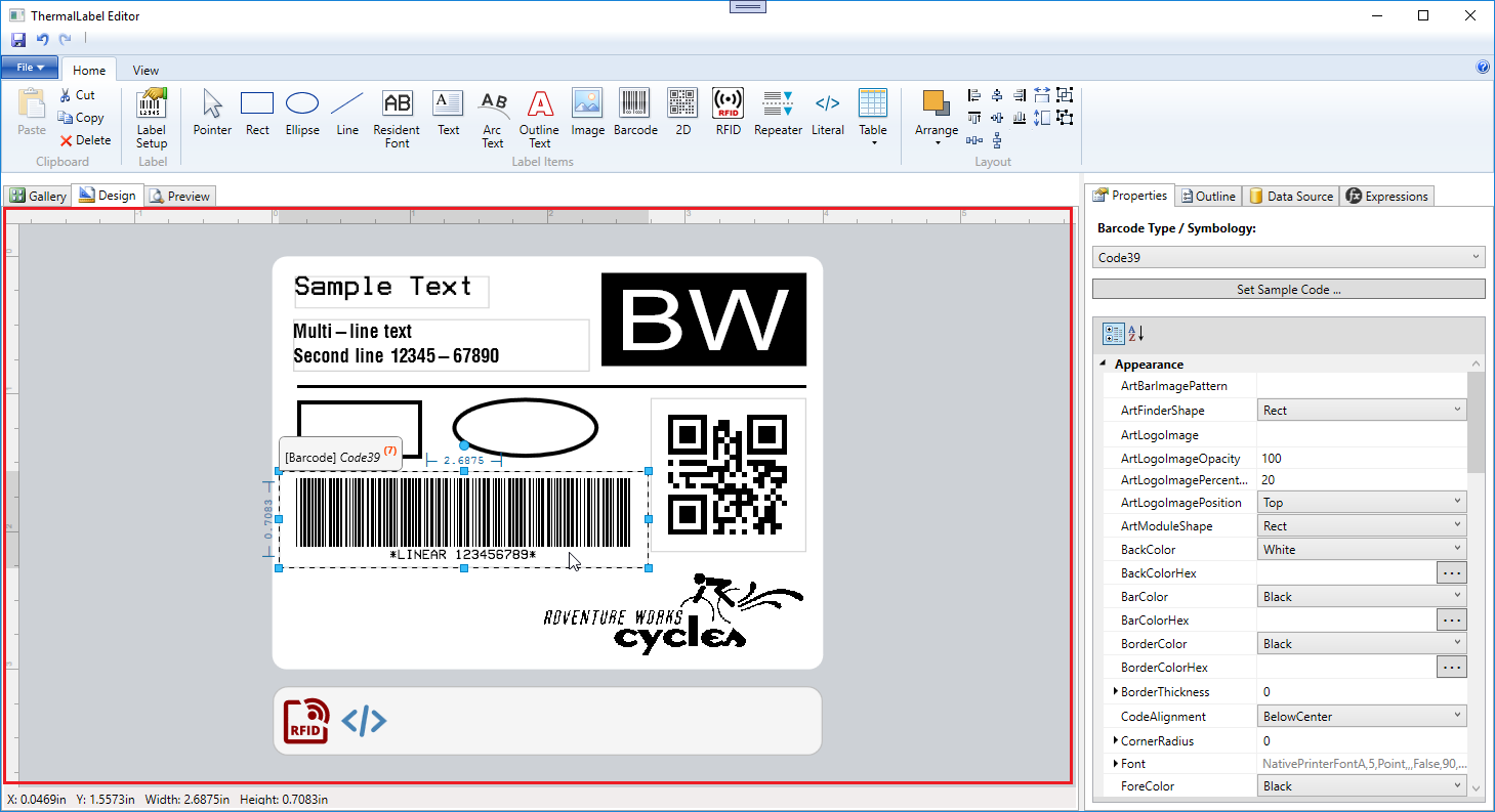
The following is a screenshot of the sample app shipped with the ThermalLabel SDK package.
WPF
Windows Forms
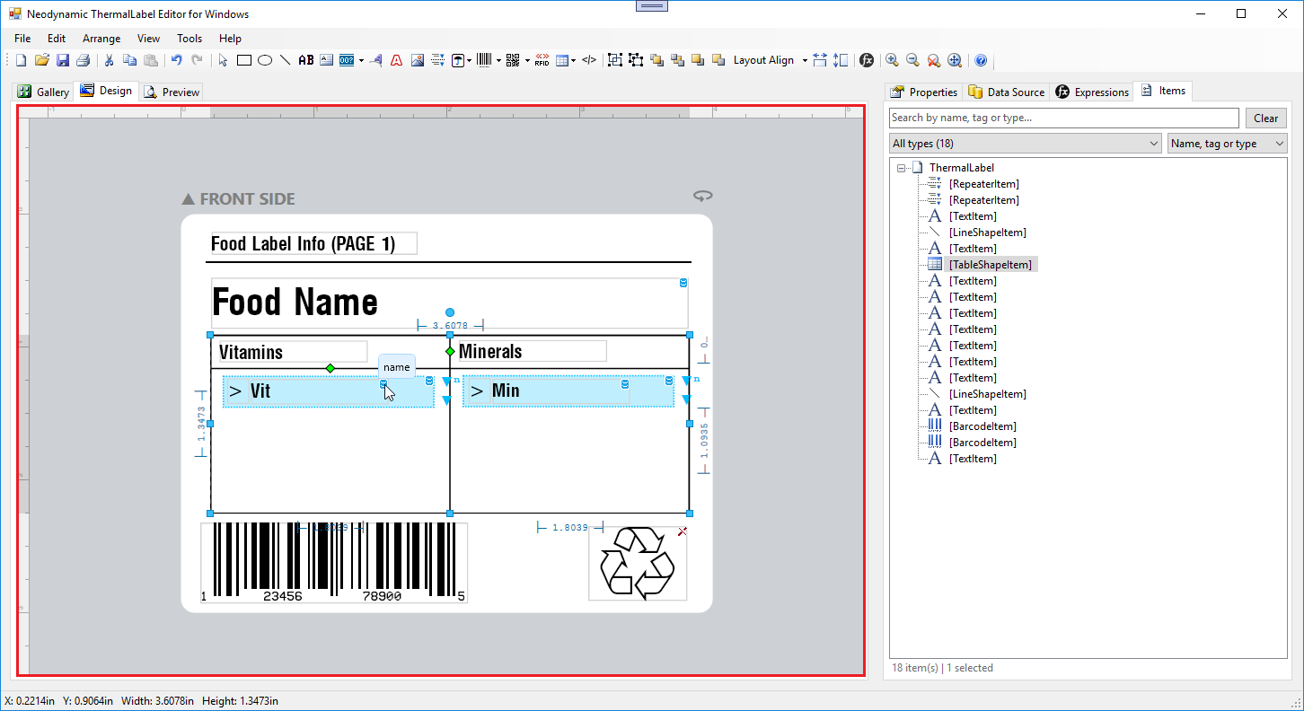
In the screenshot, pay attention to the area surrounded by the rulers (inside the red rectangle): that is the ThermalLabelEditor component. The rest of the UI (menu, toolbar, status bar, property dialogs, etc.) is designed and coded by you. You can build a Visual Label Designer inside your own WPF or Windows Forms app using whatever UI you prefer: a Ribbon instead of a standard menu, dialog boxes instead of a "Properties Window/Grid", and so on. You are free to surround the ThermalLabelEditor component to match your app's style.
Note
This page groups the editor's features by topic and shows how to use the most important ones. The full list of classes, properties, methods and events is in the API Reference.
System Requirements
- ThermalLabel Windows Editor (
Neodynamic.Windows.ThermalLabelEditor.dll) - ThermalLabel SDK 16.0 (
Neodynamic.SDK.ThermalLabel.dll) - ThermalLabel SDK 16.0 Windows Printing (
Neodynamic.SDK.ThermalLabel.WindowsPrinting.dll) - .NET Framework 4.6.1+ or .NET Core 3.1+
- SkiaSharp 1.68.3+
- System.Text.Encoding.CodePages 4.4.0+
The editor draws its items with SkiaSharp, so the SkiaSharp package must be referenced by your project.
.NET Assemblies and Namespaces
The editor ships in a WPF version and a Windows Forms version. Both are in the same assembly, Neodynamic.Windows.ThermalLabelEditor.dll:
| Platform | Class |
|---|---|
| WPF | Neodynamic.Windows.WPF.ThermalLabelEditor.ThermalLabelEditor |
| Windows Forms | Neodynamic.Windows.Forms.ThermalLabelEditor.ThermalLabelEditor |
Almost everything in this page applies to both; the differences are called out where they matter (for example, WPF uses Color/Brush values from System.Windows.Media, while Windows Forms uses System.Drawing.Color).
Types shared by both editions (enums, event args, settings classes, LabelDocument) live in the Neodynamic.Windows.ThermalLabelEditor namespace. WPF routed commands live in Neodynamic.Windows.WPF.ThermalLabelEditor.EditorCommands.
Licensing
Set your license before the first editor is created:
Neodynamic.Windows.WPF.ThermalLabelEditor.ThermalLabelEditor.LicenseOwner = "YOUR-LICENSE-OWNER";
Neodynamic.Windows.WPF.ThermalLabelEditor.ThermalLabelEditor.LicenseKey   = "YOUR-LICENSE-KEY";
In the Windows Forms edition, use the same static properties on Neodynamic.Windows.Forms.ThermalLabelEditor.ThermalLabelEditor. Without a valid license, the editor runs in trial mode and displays a trial notice on its surface.
Sample Application Projects
The ThermalLabel SDK repo on GitHub provides Windows Forms and WPF projects that use the ThermalLabelEditor component. Open them with Visual Studio to learn how the component works and how to interact with it from your own app. The Windows Forms project uses a "Properties Window" approach to let the user change the data of each item on the label, while the WPF project uses a "Properties Dialog" approach for the same task.
Important
The two sample projects are very simple and do NOT demo ALL the ThermalLabel SDK and Editor features! They might contain errors, bugs or bad software development practices, so do not treat them as a model of how to structure an app. They were written only to demo how to interact with the ThermalLabelEditor component. They are NOT part of our product; they are a sample of how your own code can talk to it.
Getting Started
The editor works on a ThermalLabel object from the ThermalLabel SDK. You load a label into the editor, the user edits it visually, and you get a ThermalLabel back to save or print.
using Neodynamic.SDK.Printing;

// 1. Load a label (an existing one, or a new one)
ThermalLabel tl = ThermalLabel.CreateFromXmlTemplate(File.ReadAllText("label.xml"));
editor.LoadThermalLabel(tl);

// 2. ...the user designs on the surface...

// 3. Get the edited label back
ThermalLabel edited = editor.CreateThermalLabel();

// ...or save it directly (XML or JSON)
editor.Save(@"C:\labels\label.xml");
editor.SaveAsJson(@"C:\labels\label.json");
Key concepts:
LabelDocument: a lightweight description of the label being edited (unit, size, margins, pages, duplex flag, etc.), created automatically byLoadThermalLabel(). To change those settings on the open label, callUpdateLabelDocument().- Items: the editor works on the SDK
Itemclasses. You can add items from code withAddItem(),InsertItem(),AddItemsRange()andInsertItemsRange(). - Item index: the index of an item is its position in
CreateThermalLabel().Items. The...ByIndex/...ByIndexesmethods use this index space. - Close the label: call
Close()to close the current label document.
Item Creation Tools
The user (or your toolbar) creates items by activating a tool and then drawing on the surface. Set ActiveTool to one of the EditorTool values and provide a template item in ActiveToolItem; the editor clones that item every time the user draws a new one.
EditorTool |
Item type expected in ActiveToolItem |
|---|---|
Pointer |
(none) The default tool, used for selecting and transforming items |
Rectangle |
RectangleShapeItem |
Ellipse |
EllipseShapeItem |
Line |
LineShapeItem |
Text |
TextItem |
Barcode |
BarcodeItem |
Image |
ImageItem |
Literal |
LiteralItem |
RFIDTag |
RFIDTagItem |
Table |
TableShapeItem |
Repeater |
RepeaterItem |
// Let the user draw a Code 128 barcode
editor.ActiveToolItem = new BarcodeItem { Symbology = BarcodeSymbology.Code128, Code = "12345" };
editor.ActiveTool = EditorTool.Barcode;
// After the item is drawn, the editor goes back to the Pointer tool automatically.
Note
The type of ActiveToolItem must match ActiveTool, otherwise the editor throws an exception when the user starts drawing. Handle NewItemCreated to react when an item has been created.
Component Tray. RFIDTagItem and LiteralItem have no visual footprint on the printed label. Instead of floating over the label, they are shown as icons in a component tray docked below the label. Items in the tray are anchored (they can't be dragged or nudged) and are shared by both sides of a duplex label. The tray's look is customizable (see Visual Customization).
Selection
- Click an item to select it. CTRL + click adds/removes items from the selection.
- Rubber-band selection: drag a rectangle on the surface. By default an item must be fully inside the rectangle; set
AllowPartialHitTestSelection = trueto select every item the rectangle touches. - Groups: items that belong to the same group (see Grouping) are always selected together.
- Select from code:
SelectAll(),UnselectAll(),SelectItemByName(),SelectItemsByNames(),SelectItemsByTag(),SelectItemByIndex(),SelectItemsByIndexes()andSelectItemsByType()(for example"TextItem","BarcodeItem").GetSelectedItemsIndexes()returns the indexes of the selected items. - Keyboard focus: CTRL + SHIFT + LEFT / RIGHT moves the selection to the previous / next item.
- Read the selection: handle
SelectionChangedand readCurrentSelection(the selected items) andCurrentSelectionArea(the selection's location and size, available throughSelectionAreaChanged).
Items that are not editable (Item.Editable = false) can't be selected, and locked items (Item.Locked = true) can be selected but not moved, resized or rotated.
Selection Handles (Adorners)
When items are selected, adorners appear around them: resize handles, a rotation handle, and a text legend with the item's position and size. Different item types get different adorners:
| Adorner | Used for |
|---|---|
| Basic | Most items: 8 resize handles plus rotation |
| Line | Line items: one handle per end point |
| Table | Table items: resize handles plus column and row dividers |
| Fixed size | Items whose size can't be changed by the user |
| Tray | Component tray items |
Hold SHIFT while resizing from a corner to keep the item's aspect ratio. Hold SHIFT while dragging the end of a line to constrain it to horizontal or vertical.
Out-of-Label Indicator
An item that is (even partly) outside the printable area of the label is outlined with a dashed frame. For round labels the printable area is the inscribed ellipse. Turn this on/off with AdornerOutOfLabelVisible and change its color with AdornerOutOfLabelColor.
Keyboard Shortcuts
| Action / Operation | Keyboard Shortcut | KeyboardShortcuts flag |
|---|---|---|
| Clipboard Copy | CTRL + C or CTRL + INSERT | CtrlC |
| Clipboard Cut | CTRL + X or SHIFT + DELETE | CtrlX |
| Clipboard Paste | CTRL + V or SHIFT + INSERT | CtrlV |
| Undo | CTRL + Z | CtrlZ |
| Redo | CTRL + Y | CtrlY |
| Select All Items | CTRL + A | CtrlA |
| Delete Selected Items | DELETE | Delete |
| Move Selected Items (Small Step) | ARROW KEYS (also I / J / K / L) | ArrowKeys |
| Move Selected Items (Long Step) | CTRL + ARROW KEYS | ArrowKeys |
| Edit TextItem | F2 | F2 |
| Leave text editing | ESC | |
| Select previous / next item | CTRL + SHIFT + LEFT / RIGHT | |
| Zoom In | CTRL + PLUS SIGN or CTRL + MOUSE WHEEL UP | CtrlPlus |
| Zoom Out | CTRL + MINUS SIGN or CTRL + MOUSE WHEEL DOWN | CtrlMinus |
| Zoom 100% | CTRL + 0 (ZERO) | CtrlZero |
While a TextItem is in text-editing mode, the global shortcuts are not processed, so the text box keeps its normal editing behavior.
Disabling shortcuts. DisableShortcuts is a [Flags] enum, so you can switch off any combination. This is useful when your app already uses one of these keys for something else:
// Let the host app handle Delete and F2 itself
editor.DisableShortcuts = KeyboardShortcuts.Delete | KeyboardShortcuts.F2;

// Turn every shortcut off
editor.DisableShortcuts = KeyboardShortcuts.All;
Arrow-key step size. ArrowKeysShortStep (default 0.01 inch) and ArrowKeysLargeStep (with CTRL, default 0.1 inch) are expressed in the label's current unit. When SnapToGrid is on, each key press moves by one grid division instead.
WPF Routed Commands
For WPF apps, EditorCommands exposes the editor's actions as RoutedCommands, so you can bind menu items and toolbar buttons in XAML and get automatic enabled/disabled state through each command's CanExecute:
Undo, Redo, Cut, Copy, Paste, SelectAll, DeleteSelectedItems, DeleteAll, BringForward, BringToFront, SendBackward, SendToBack, LockSelectedItems, UnlockSelectedItems, SelectItemByName, SelectItemsByNames, UpdateSelectionItemsProperties, Save, SaveAsJson, Load, UpdateLabelDocument and RotateView.
<MenuItem Header="Undo" Command="ed:EditorCommands.Undo" CommandTarget="{Binding ElementName=labelEditor}" />
<MenuItem Header="Save" Command="ed:EditorCommands.Save" CommandParameter="C:\labels\label.xml"
          CommandTarget="{Binding ElementName=labelEditor}" />
Some commands need a CommandParameter: Save / SaveAsJson (file path or Stream), Load (XML template string or ThermalLabel), UpdateLabelDocument (a LabelDocument), RotateView (a Rotate value), SelectItemByName (string) and SelectItemsByNames (string[]).
Zooming
The editor supports high-quality zooming from 10% to 1000% through the Zoom property (default 100).
editor.Zoom = 200;   // 200%
editor.Zoom = 0;     // 0 means "fit the whole label (and its legend/tray) in the viewer"
Users can zoom with CTRL + MOUSE WHEEL, CTRL + PLUS, CTRL + MINUS and CTRL + 0 (each step is 10%).
For ImageItem objects, ImageProcessingDpi and ImageProcessingMonochromeDpi control the resolution used to process images on the surface. Leave them at 0 (Auto) to derive it from the zoom and monitor scale. Set ImageProcessingMonochromeDpi to your printer's resolution so the dithering you preview matches the printed output.
Rulers, Grid and Snapping
Rulers
There are two rulers, one along the top and one along the left side of the surface. The ruler unit automatically follows the unit of the label being edited, and the rulers highlight the position and size of the current selection. Show or hide them with ShowRuler. Their colors are customizable (see Visual Customization).
Grid
| Property | Description |
|---|---|
ShowGrid |
Shows or hides the grid (default false) |
GridSize |
Size of a grid division in the label's current unit |
GridType |
GridType.Lines (default) or GridType.Dots |
GridColor |
Color of the grid |
Snap to Grid
With SnapToGrid = true, items are placed and sized according to the grid divisions as the user draws and moves them. Snapping is applied to items whose rotation is a multiple of 90 degrees. You can also snap on demand, regardless of the SnapToGrid setting: SnapToGridAll(), SnapToGridByCurrentSelection(), SnapToGridByItemName() and SnapToGridByItemIndex().
Snap to Items (Smart Guides)
With SnapToItems = true, dragging an item shows guide lines when its edges or its center line up with another item's edges or center (left, center and right edges horizontally; top, middle and bottom edges vertically). The item follows the mouse freely during the drag; when the user releases the mouse, it snaps to the closest guide. The snap distance is constant on screen (about 6 pixels), so it feels the same at any zoom level. Locked, hidden and component-tray items are ignored as snap targets. Change the guide color with GuidelineColor.
Angle Snap
AngleSnap (default 5 degrees) controls the rotation step when the user rotates an item with its rotation handle.
Grouping, Alignment and Sizing
- Group / Ungroup:
Group()andUngroup()assign or clear a sharedGroupNameon the selected items. Clicking any item of a group selects the whole group, and pasting a group creates a new, independent group. - Alignment and distribution:
LayoutSelectedItems(LayoutAlignment)aligns the selected items to the first one (Left,Right,Top,Bottom,CenterHorizontal,CenterVertical), or distributes them with equal spacing (DistributeHorizontal,DistributeVertical). With a single item selected, it aligns that item to the label itself. - Same size:
SetSelectedItemsToSameSize(sameWidth, sameHeight)resizes the selected items to match the first one. - Move by code:
MoveSelectedItems(deltaX, deltaY). - Lock / Unlock:
LockSelectedItems()andUnlockSelectedItems()prevent accidental moves. Locked items show a lock icon.
Z-Ordering
Z-ordering is the position of an item in the Items collection of the ThermalLabel being edited. Use BringForward(), BringToFront(), SendBackward() and SendToBack() on the current selection.
In-Place Text Editing
Users can edit the text of a TextItem directly on the surface by double-clicking it or pressing F2; ESC leaves edit mode. In-place edition also works when the TextItem is rotated. Handle CurrentSelectionTextChanged to follow the text as the user types.
Set TextItemEditModeEnabled = false to disable in-place editing for all text items (for example, if your app edits text through its own dialog). Items with ReadOnly = true can't be edited in place.
Clipboard
Cut, Copy and Paste work on the selected items. ClipboardMode chooses where the data lives:
EditorClipboardMode |
Behavior |
|---|---|
Internal (default) |
Items live only inside the editor instance. You can't paste them into another app. |
System |
Items are also published to the OS Clipboard, so they can be pasted into another editor instance (MDI apps) or another application that hosts the editor. |
editor.ClipboardMode = EditorClipboardMode.System;
Other things to know:
- Cascading paste: each consecutive paste of the same selection is offset a little so the copies don't sit exactly on top of each other.
- Cut keeps move semantics: if you cut, flip the duplex side and paste, the items move to the other side (see Duplex Label Design).
- UI state: handle
ClipboardStateChanged(or bind to the read-onlyCanCopy,CanCutandCanPasteproperties) to enable/disable your buttons. InSystemmode,CanPastefollows the OS clipboard. ClipboardItems()returns the items currently in the internal clipboard, andDisableClipboardturns the feature off.
Warning
ClipboardClear() also clears the Undo/Redo history.
Undo / Redo
The editor records a snapshot of the label after every user action (moving, resizing, rotating, creating, deleting, pasting, flipping the duplex side, rotating the view, and so on). Call Undo() and Redo() from your UI, and use CanUndo / CanRedo plus the UndoStateChanged event to keep your buttons in sync:
editor.UndoStateChanged += (s, e) =>
{
    undoButton.IsEnabled = editor.CanUndo;
    redoButton.IsEnabled = editor.CanRedo;
};
Undo/Redo also restores which duplex side was active, and items deleted when a duplex document is converted to a simplex one come back with Undo.
View Rotation
RotateView(Rotate) rotates the way the whole label is shown on the surface (Rotate.None, Degree90, Degree180, Degree270), for example to design a label the way it comes out of a printer that feeds it sideways. Items, margins, duplex pages and the background image rotate with the view, and the rulers and grid are updated.
editor.ViewRotationChanged += (s, e) => statusRotation.Text = editor.ViewRotation.ToString();
editor.RotateView(Rotate.Degree90);
ViewRotationreturns the current rotation.CreateThermalLabel()returns the label as it is currently shown, i.e. with the view rotation applied.Save()andSaveAsJson()store the label un-rotated by default (the label as the user originally designed it). PasskeepViewRotation: trueto store it as it is currently shown.RotateLabel(thermalLabel, currentRotation, newRotation)is a helper that rotates anyThermalLabelobject without touching the editor.
Duplex Label Design (Front and Back)
A duplex label has a Front and a Back side. The editor shows one side at a time and lets the user flip between them. A duplex design is a LabelDocument with IsDuplexDesign = true and exactly two pages (Pages[0] is the Front, Pages[1] is the Back).
Flipping with Animation
FlipDuplexSide() flips the label with a short "squish" animation. The same flip is available to the user through a button drawn next to the "Front Side" / "Back Side" legend above the label.
editor.ActiveDuplexSideChanged += (s, e) =>
    sideLabel.Text = editor.ActiveDuplexSide == DuplexSide.Front ? "Front" : "Back";

flipButton.Click += (s, e) => editor.FlipDuplexSide();
ActiveDuplexSidereturns the side currently shown (DuplexSide.FrontorDuplexSide.Back).- The selection is cleared when the side changes, and
Delete Alland rubber-band selection only act on the visible side. - Both sides share one component tray.
- The flip is also undoable: Undo/Redo restores the side that was active at that moment.
Moving Items Between Sides
Cut an item on one side, flip, and paste: the item moves to the new side keeping its relative position, and DuplexItemSideChanged is raised with the item, the source side and the target side. Pasting a copy (Copy instead of Cut) always creates the clone on the side being edited.
Out-of-Bounds Validation
The two sides are exported as pages of a single label, so items must stay inside the side they belong to. DuplexOutOfBoundsHandling tells CreateThermalLabel() what to do when an item is outside its side:
DuplexOutOfBoundsPolicy |
Behavior |
|---|---|
RaiseValidationWarning (default) |
Raises DuplexItemsOutOfBounds. Set e.Cancel = true to abort the export (CreateThermalLabel() then returns null). |
MoveOutsideBoundingBox |
Moves the item outside the global duplex bounding box so it doesn't print on either side, keeping its data. |
SetInvisible |
Keeps the item but sets Visible = false, so it isn't printed. |
editor.DuplexItemsOutOfBounds += (s, e) =>
{
    var names = string.Join(", ", e.Items.Select(i => $"{i.Item.Name} ({i.Side})"));
    var answer = MessageBox.Show($"These items are outside their side: {names}. Export anyway?",
                                 "Duplex", MessageBoxButton.YesNo);
    e.Cancel = (answer == MessageBoxResult.No);
};
You can also check at any time with GetDuplexItemsOutOfBounds() (for example, before enabling a Print button). It looks at both sides, not only the visible one.
Switching from Duplex to Simplex
If UpdateLabelDocument() converts a duplex design into a simplex one while the Back side has items, those items would be deleted. BeforeDuplexDesignDisabled fires first so you can ask the user:
editor.BeforeDuplexDesignDisabled += (s, e) =>
{
    var ok = MessageBox.Show($"{e.BackSideItems.Count} item(s) on the Back side will be deleted. Continue?",
                             "Duplex", MessageBoxButton.YesNo) == MessageBoxResult.Yes;
    e.Cancel = !ok;   // Cancel = true: nothing is modified and UpdateLabelDocument() returns false
};
Customizing the Duplex UI
DuplexFlipColor, DuplexFlipHoverColor and DuplexLegendsForeColor change the colors of the flip button and the side legend.
Label Shapes and Backgrounds
- Round labels: when the
LabelDocumenthas an elliptical shape, the label frame is drawn as an ellipse (a circle when width equals height) and the out-of-label check uses that shape. - Design background image: the label's
DesignBackgroundImageis shown behind the items on the surface (for example, a scan of a pre-printed label). In duplex designs the image covers the whole Front + gap + Back area and the editor crops out the part that belongs to the visible side. - Frame corner radius:
LabelDocumentFrameCornerRadiusrounds the corners of the label frame and tray.
Item Visual Aids
The editor shows small reference icons on items to tell the user about their state, and a tooltip appears when the pointer is over the item:
| Icon / aid | Shown when |
|---|---|
| Data bound | The item is bound to a data field |
| Expression | The item contains an expression |
| Locked | The item is locked |
| Non editable | Editable = false |
| Read only | ReadOnly = true |
| Not visible | Visible = false |
| Comment | The item has Comments. The comment text appears as a tooltip when the pointer is over the item. |
| Print as resident element | The item is configured to print as a printer-resident element (and an error variant when it can't) |
The item tooltip also shows the item's index. Use RefIconsOpacity to make all these reference icons more or less transparent, and AdornerLegendsVisible to show or hide the text legends of the selection adorners.
Picture missing aid. When an ImageItem's source can't be found, the editor draws a placeholder image instead. Choose it with NoImageFileName.
Picture monochrome preview. The ImageItemUtils class has a method that returns the black & white result of converting an ImageItem's source using that item's MonochromeSettings. Use it to show the user a live preview while they fine-tune those options.
Visual Customization
Almost every color, border, adorner and icon of the editor can be changed so it matches the look of the app that hosts it.
| Area | What you can customize |
|---|---|
| Designer background | The area around the label (Background) |
| Rulers | Background, lines, foreground (text) and selection highlight colors |
| Label frame | Frame background (solid color or image), frame border, margin area color (LabelDocumentMarginColor) and corner radius |
| Grid and guides | Grid color and type, snap guideline color |
| Adorners | Handle fill, handle hover fill, handle border, selection frame border, rubber-band border and fill, and out-of-label color |
| Duplex | Flip button, flip button hover and legend text colors |
| Item tooltips | Background, border, text and item-index text colors |
| Component tray | Background, border, icon size, gap from the label and the RFID/Literal icons (image file or vector path with its color) |
| Repeater items | The color used to draw RepeaterItem objects |
| Reference icons | Opacity of all the reference icons, and the 12x12 Base64 icon used for each item state (see below) |
| Strings | UpdateBaseOnI18N() refreshes the editor's strings from the current ThermalLabel.I18N object |
Property names follow the same pattern in both editions (AdornerHandlerBackColor, GridColor, TrayBackColor, ...). The only differences are the types: WPF uses System.Windows.Media.Color (and a Brush for RulerBackground and LabelDocumentFrameBackground), while Windows Forms uses System.Drawing.Color (and RulerBackColor and LabelDocumentFrameBackColor / LabelDocumentFrameBackgroundImage).
// WPF
editor.AdornerHandlerBackColor  = Colors.White;
editor.AdornerHandlerBorderColor = Colors.DodgerBlue;
editor.AdornerSelectionBorderColor = Colors.DodgerBlue;
editor.GridColor = Color.FromArgb(128, 200, 200, 200);
editor.GuidelineColor = Colors.Magenta;
editor.TrayIconSize = 24;
Global Icon Overrides
The icons used for item states (IconDataBound, IconLocked, IconNonEditable, IconExpression, IconNotVisible, IconComment, IconReadOnly, IconPrintAsResidentElement, IconPrintAsResidentElementError) are static properties holding a 12x12 image as a Base64 string. Because they are static, changing one affects every editor instance in the process.
Saving and Loading a Theme as JSON
All color, image and icon settings can be captured to / applied from JSON, so you can ship the look of your editor as a file, let users pick a skin, or keep several editors consistent. This works the same for WPF and Windows Forms through extension methods in the Neodynamic.Windows.ThermalLabelEditor namespace.
using Neodynamic.Windows.ThermalLabelEditor;

// Save the current look to a file, or get it as a string
editor.SaveAppearanceSettings(@"C:\themes\dark.json");
string json = editor.GetAppearanceSettingsJson();

// Apply a theme from a file or from a string
editor.LoadAppearanceSettings(@"C:\themes\dark.json");
editor.ApplyAppearanceSettingsJson(json);

// Or work with the settings object directly
ThermalLabelEditorAppearanceSettings settings = editor.GetAppearanceSettings();
settings.GridColor = "#80C8C8C8";
editor.ApplyAppearanceSettings(settings);
Things to know about the JSON format:
- Colors are strings in
#AARRGGBBform (#RRGGBBis also accepted and means fully opaque). - Partial themes are supported. Only the properties present in the JSON are applied, everything else keeps its current value. A theme file can be as small as:
{
  "AdornerHandlerBackColor": "#FFFFFFFF",
  "AdornerHandlerBorderColor": "#FF1E90FF",
  "GridColor": "#80C8C8C8",
  "TrayIconSize": 24
}
- The settings include the
Icon...static overrides, so applying a theme with those keys changes the icons of every editor in the process.
Events Cheat Sheet
| Event | Raised when | Typical use |
|---|---|---|
LabelLoaded |
The label is fully loaded on the surface | Enable your UI, set the initial zoom |
SelectionChanged |
The selection changes | Fill your properties window from CurrentSelection |
SelectionAreaChanged |
The location or size of the selection changes | Update X/Y/W/H boxes from CurrentSelectionArea |
SelectionItemPropertyChanged |
A property of the selected item changes (e.IsLiveUpdate tells you if it's part of a drag) |
Keep the properties window in sync |
SelectionTransformStarted / SelectionTransformEnded |
The user starts / finishes moving, resizing or rotating | Do expensive UI refreshes once per gesture |
NewItemCreated |
An item is created (by a tool or by Paste) | Show the properties dialog for the new item |
CurrentSelectionBeforeDelete |
The selection is about to be deleted | Ask for confirmation (set e.Cancel = true) |
CurrentSelectionAfterDelete |
The selection was deleted | Refresh dependent UI |
CurrentSelectionTextChanged |
The text of a TextItem changes while editing | Live preview, character counters |
UndoStateChanged |
Undo/Redo availability changes | Enable/disable Undo and Redo buttons |
ClipboardStateChanged |
Clipboard availability changes | Enable/disable Cut, Copy and Paste buttons |
ViewRotationChanged |
The view rotation changes | Update the status bar |
ActiveDuplexSideChanged |
The visible duplex side changes | Update the Front/Back indicator |
DuplexItemsOutOfBounds |
CreateThermalLabel() finds items outside their duplex side |
Warn the user, optionally cancel the export |
DuplexItemSideChanged |
An item moves from one duplex side to the other | Log or refresh |
BeforeDuplexDesignDisabled |
A duplex document is about to become simplex while the Back side has items | Ask for confirmation |
Examples
Properties window that stays responsive while dragging. SelectionItemPropertyChanged can fire many times per second during a drag. The editor throttles those live notifications, but you should still do the heavy work once per gesture:
editor.SelectionChanged += (s, e) => RefreshPropertiesWindow(editor.CurrentSelection);

editor.SelectionItemPropertyChanged += (s, e) =>
{
    if (e.IsLiveUpdate) return;      // skip intermediate updates while dragging
    RefreshPropertiesWindow(editor.CurrentSelection);
};

editor.SelectionTransformEnded += (s, e) => RefreshPropertiesWindow(editor.CurrentSelection);
Confirm before deleting.
editor.CurrentSelectionBeforeDelete += (s, e) =>
{
    e.Cancel = MessageBox.Show("Delete the selected items?", "Confirm",
                               MessageBoxButton.YesNo) == MessageBoxResult.No;
};
Open your properties dialog for each new item.
editor.NewItemCreated += (s, e) => ShowPropertiesDialog(editor.CurrentSelection);
Toolbar state.
editor.ClipboardStateChanged += (s, e) =>
{
    cutButton.IsEnabled   = editor.CanCut;
    copyButton.IsEnabled  = editor.CanCopy;
    pasteButton.IsEnabled = editor.CanPaste;
};
Windows Forms. The WinForms control exposes the same events (and the same duplex event args), so the snippets above work with minimal changes, for example:
labelEditor.DuplexItemsOutOfBounds += (s, e) => { /* same e.Items / e.Cancel */ };
labelEditor.SelectionChanged += (s, e) => RefreshPropertiesWindow(labelEditor.CurrentSelection);
Features at a Glance
- Rulers: top and left rulers that follow the label's unit and show the selection extent; colors are customizable.
- Items' selection and handlers: rubber-band selection, click, CTRL + click, move/resize/rotate handlers, keyboard movement.
- Keyboard-based item movement: arrow keys for small steps, CTRL + arrow keys for long steps.
- In-place text edition: double-click or F2, also on rotated text items.
- Picture missing aid and picture monochrome preview for
ImageItemobjects. - Items' comments: tooltip shown when the pointer is over an item that has
Comments. - High quality zoom: 10% to 1000%, plus zoom-to-fit.
- Undo/Redo and Cut-Copy-Paste (internal or system clipboard).
- Z-ordering, grouping, alignment, distribution and same size tools.
- Grid lines or dots, snap to grid, snap to nearby items with guide lines, angle snap.
- Locking items so they can't be moved accidentally.
- View rotation in 90-degree steps.
- Duplex (Front/Back) design with flip animation and out-of-bounds validation.
- Round labels, design background image, component tray for RFID tags and literals.
- Full visual customization with JSON themes.
- WPF routed commands for declarative UI binding.
Breaking Changes (from versions 4.0 to 7.0)
- The BarcodeItemUtils class moved to the Neodynamic.SDK.ThermalLabel.dll assembly.
Migrating to ThermalLabelEditor v16
If you're using an older version of ThermalLabelWebEditor (4.0 to 7.0), follow these steps to migrate to Version 16.0:
- v16 requires .NET Framework 4.6.1+ or .NET Core 3.1+ (older .NET versions are no longer supported).
- v16 requires your project to reference the following NuGet packages:
- SkiaSharp 1.68.3+
- System.Text.Encoding.CodePages 4.4.0+
- Any .NET project using the new Windows Editor v16 must reference the new Neodynamic.SDK.ThermalLabel.WindowsPrinting.dll assembly and the new Neodynamic.SDK.ThermalLabel.dll assembly.